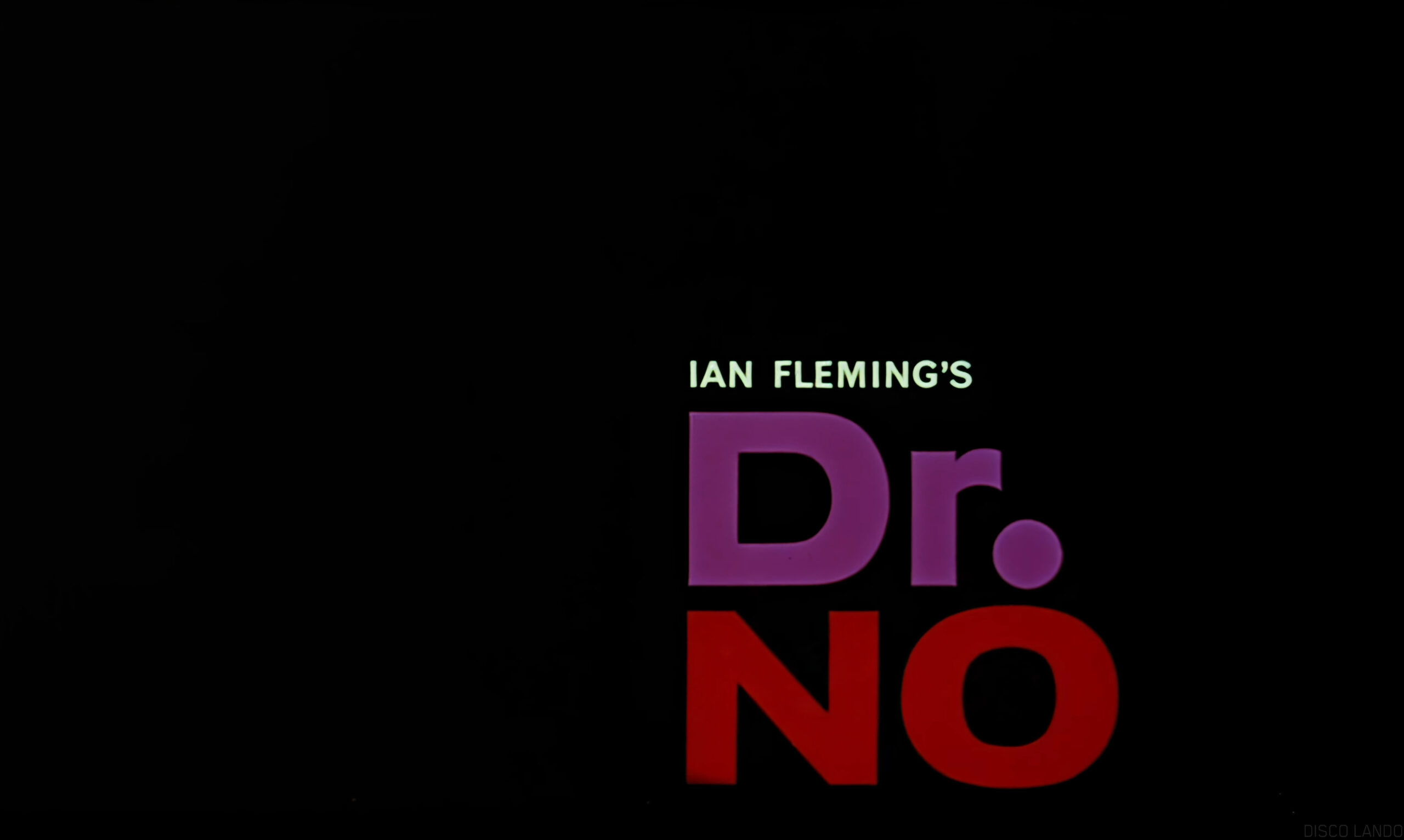
This technique is placement of elements based on seeing visual relationships & contrasts & making connections for viewers based on said relationships. This can both be used as an idea on its own, & be used to help build a grid. It can be compared to painting: It starts fat & loose with very quick decisions when the materials are put together in a composition, then some adjustments are made based off of the interactions of the materials in order to make something appropriate for the design to communicate with its audience. Ink splatters can be used to hide or reveal text in a sequence of images, & type can play off rhythms in oddly shaped colors & glitch texture. These methods can create designs that are very inviting to people to give them a viewer’s experience because they result in a structure that depends on tensions & connections to the hierarchy of a design.
